Users are often complaining that pop ups appear in front of their eyes in the most unpredictable places when they visit websites, be it an email tracker or a large scale event organizer. So why not turn them off! The answer is - online website with pop ups and other popular means of attracting customers, are in fact used to increase conversion, but not vice versa.
Indeed, pop-ups are a controversial tool. Nevertheless, pop-up windows can be used both to the users and marketers and the pop ups meaning for end results should not be underestimated.
Pop ups are used to solve the following tasks:
Also, for the most effective advertising of your benefits, decide on what is popups for your business and how they may fit into your marketing strategy.
So, what is pop up advertisement?
Pop-up ads or the so-called pop-ups are forms of online advertising on the Internet, which are often used in digital marketing, accordingly. A pop-up is a graphical user interface (GUI) display area, usually a small window that suddenly appears ("pops up") within a first period of time during the website visit in the foreground of the visual interface.
Pop up sales are a great tool for bringing attention to the most important website elements (buttons, features, events, etc.) if used and displayed appropriately. Among them, it’s wise to choose the type you need at the moment that best fits your marketing goals.
Let's talk about what pop-up windows are there. How do they differ and what functions do they have?
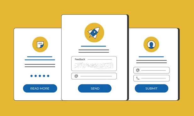
Here are some pop up examples from the point of view of a regular user who is far from digital technologies:
Entry pop-ups usually appear as soon as a landing page or your website loads, typically by blocking visitors from seeing the pages they are supposed to see until they engage with it somehow.
Such pop-ups are also called welcome windows, although they do not greet anyone, but rather serve to offer something or inform of something.
A welcome pop-up window appears in the first seconds after opening the site, when the person still does not really understand where he/she is and how interesting it is to him/her or not. So, the most user-friendly version of such a pop-up rather hides a small part of the screen and leaves an opportunity to read something on it, apart from the pop-up information.
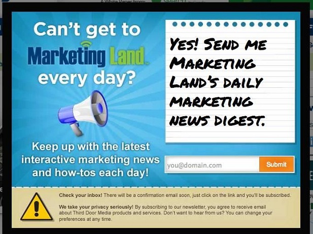
This is it - a welcome window that completely overlaps the content done right
Scrolling windows are more like a floating bar which appear as the user scrolls down the page. The time for the appearance of such a window is configured in advance: for example, when the user has already spent 1-2 minutes on the site, or if has viewed the page to a certain block, etc.
Scrolling windows may offer an answer to a question, or, for example, appear after a visitor has performed / failed to perform a certain action - authorization or filling out any form, as ups media mail, offer to unsubscribe and so on.
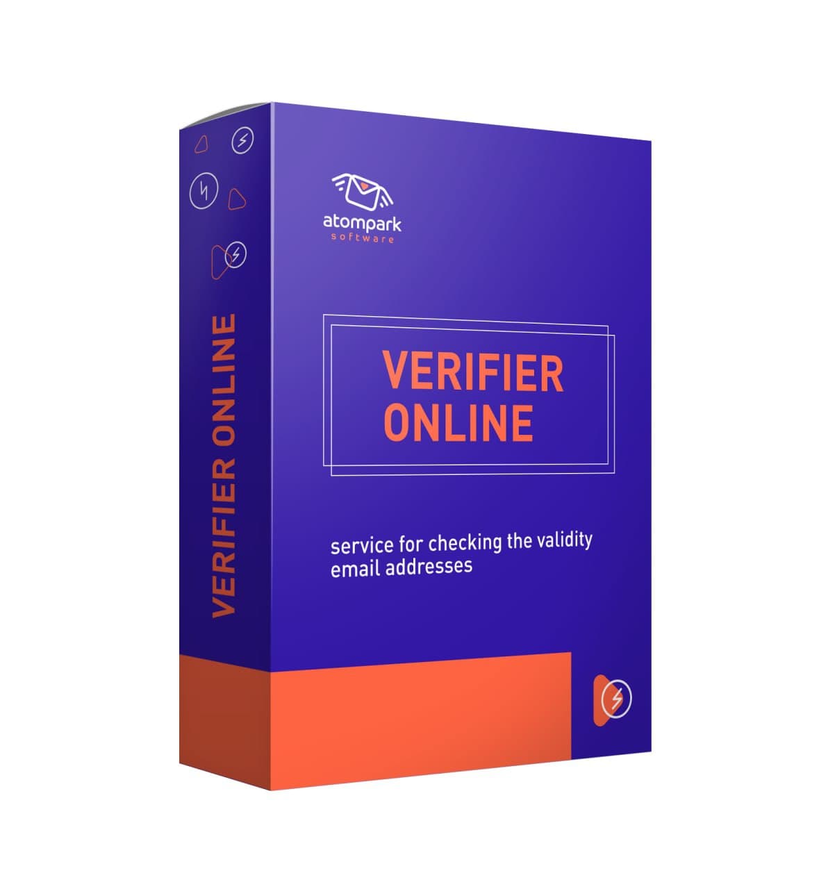
This type of window may be used to present social proof of the demand for a product / service, like verify bulk emails online free or something else.
A pop-up with a vertical scroll-bar
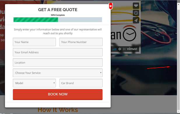
Pop-ups in this case are windows that appear either immediately upon opening, or in the first seconds of being on the site. But they do not overlap or affect the content, do not change their position when scrolling the page, and are most often located to the right of the text.
An example is an invitation to subscribe to blog updates, which will accompany the user throughout their stay on the page. The online chat windows are almost always constantly floated after the user.
Generally, there may be up to 30 variations of advertisement pop up applied on various websites depending on their business model, marketing goals and so much more. The most essential remains to make them work for the good of your website, but not to deter the users.
A couple of seconds and here floats a subscription bar to the left
Don't forget about thank you pop-ups. After a person subscribes to the newsletter or blog updates, orders a consultation, a callback or completes a survey - thank you may be a way to use a pop-up too.
How to make a pop up ad increase conversion rather than deter the users from your website? Here are some tips to consider while coming up with your pop-up ad ideas:
Also, keep track of Google search engine algorithm changes. They may provide Google Page Experience Update that often touches on some serious UX concerns, how do pop up ads work, using heavy design, unfriendly to mobile technologies and so much more.
Keep in mind the definition of pop up & its controversial nature in order to create the best possible pop-ups and retain your users, instead of deterring them.
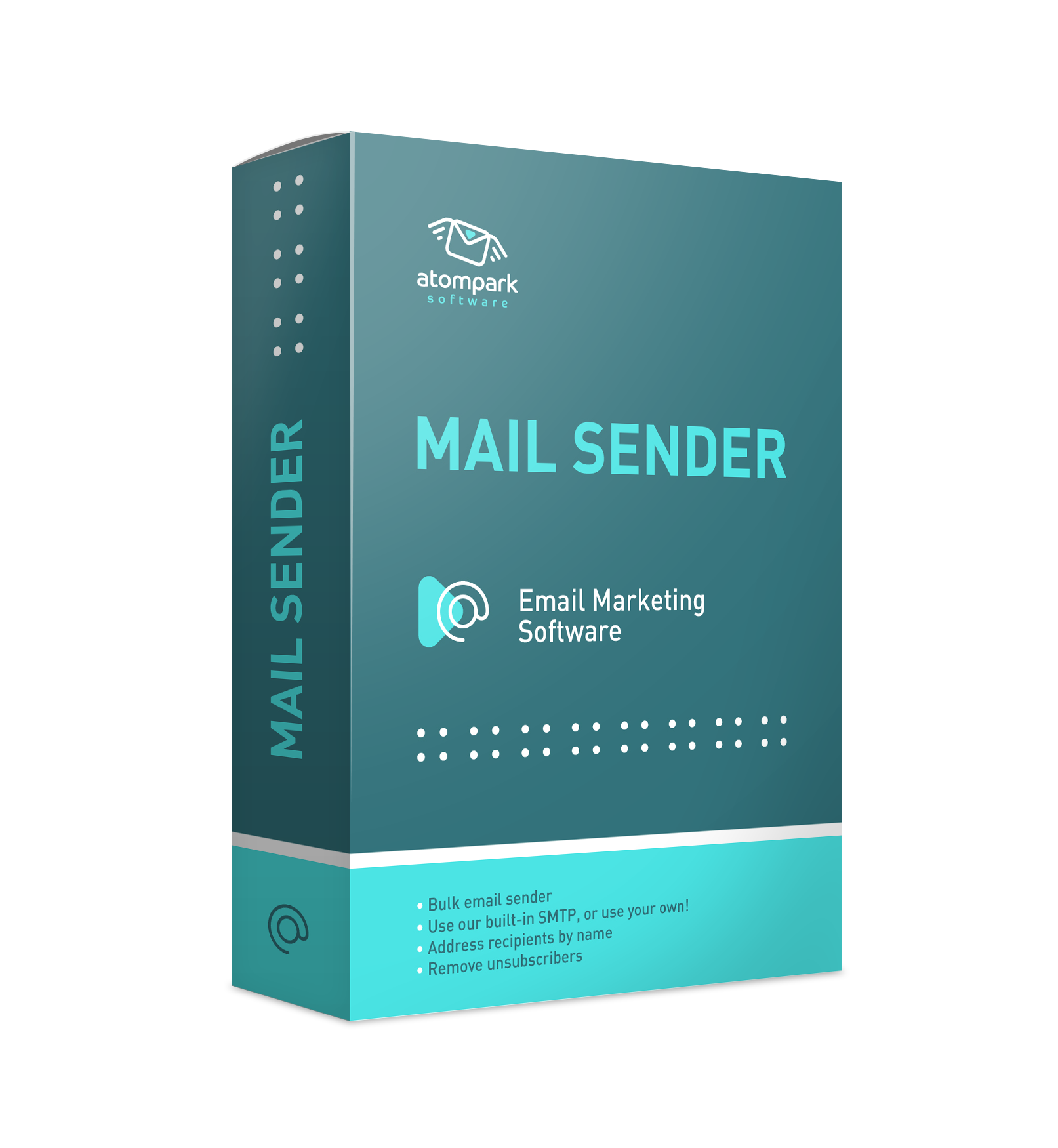
Yes, pop-ups may be an annoying part of online marketing. If they do not work so damn well we would never invest so much time and energy creating tools that make them easy for you to integrate into your marketing strategy. Bulk Email Sender will probably be a great help when you work in email marketing and need some essential help with emails, if not pop-ups. Don’t miss your chance to save time & efforts and leave it for a great pop-up design!


Subscribe to us and you will know about our latest updates and events as just they will be presented