Top Mobile Email Design Techniques, plus Statistics
Hey guys,
Hope you're doing well! Sorry for such a delay with this article, it's all because the Mail Conference I visited on Tuesday-Wednesday on a ferry from Tallinn to Stockholm.
Today I would like to provide you with the mobile email client statistics and top mobile email design techniques.
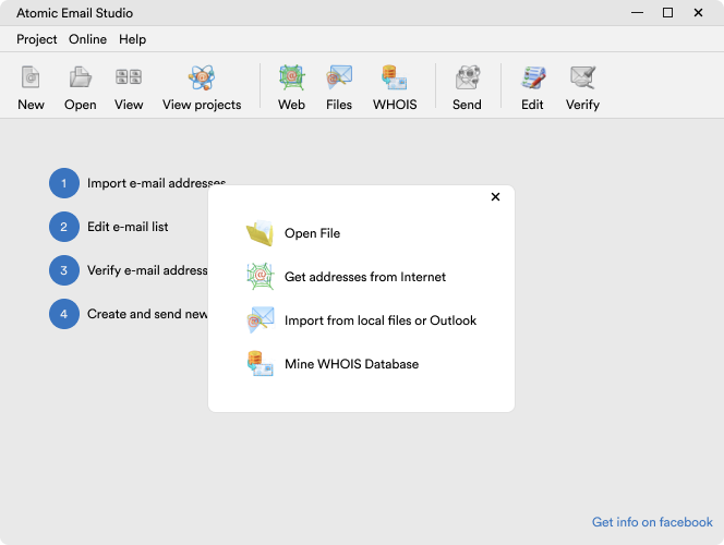
1. Send in MIME Multipart Format. Your emails are sent in both HTML and plain text formats, so for mobile devices that can't read HTML - plain text will appear just like you want it to.
2. Keep subject lines to 15 or fewer characters. Mobile devices often cut subject lines to 15 characters, so make sure your email's idea can be described with 15 characters. This is how you can improve mobile open-rate for your email campaign.
3. Make the most of pre-header text. The pre-header text contains the message at the very top of your email. Many mobile devices will display this text along with the subject line in the email preview pane. Use this space to persuade recipients to read the email. iPhones allow about 140 characters in vertical view, so keep the text short and persuasive. This is the perfect place to link to a mobile-friendly version of your email.
4. Chose the right email dimensions. Code your emails between 480 & 600 pixels, so they appear good on both mobile and desktop devices. Remember, looking good email is an opened-good email.
5. Keep the layout simple. The simplest layout is the better, one column is optimal for text and images.
6. Take it easy on the images. Include important information in the text of your email, and never send emails consisting of one big image as the only content. Include ALT text on all of your images, and keep the text short and easy-to-read. When splitting up images, stack them vertically, on top of one another, instead of next to each other, so your content stays together.
7. Design for fat fingers. Since many mobile devices have touch screens, designing links and buttons with plenty of space makes them easier to click with fingers. Apple recommends coding all links and buttons with a target area of at least 44 x 44 pixels.
8. Test to ensure good results. Always test your email campaigns - on different browsers, different platforms, different email clients. For mobile email marketing this is the must, as the mobile platforms changes constantly.


