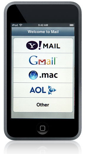
If your emails can't stretch and adapt themselves to the screen width so they look nice at any resolution - you have a real problem. Responsive email design is what it all comes down to. No need to tell you about the popularity of mobile devices - you already know that.
We have a real job ahead of us - subjecting your email template to a number of "exercises" to make it fit and flexible, just like your own body gets the needed flexibility after you put a real effort into it. It might not be an easy task, but we have to brace ourselves and get ready for some pain.
We recently talked about creating a good email template, today we're going to take it one step further and try to add another dimension to our email template by trying to make it responsive.
The craze of using mobile devices for internet has totally revolutionized the way internet marketers used to operate. Earlier, they did not have to worry about how their e-mail would look like on hundreds of different mobile devices. But nowadays, they have to. If you are an e-mail marketer, designing responsive HTML e-mails for your readers is arguably the best advice we could give you.
The report by Cell Phone Activities revealed that approximately 52% internet users read and send e-mails with their mobile phones and tablets. In simpler words, if you do not create responsive HTML e-mails, you are going to miss out on all that huge amount of traffic.
So, are you ready for pain, are you ready for suffering? If so, let's start "exercising" our email template!
Exercise 1: Small Screens Come First
You most definitely remember how the poor Alice felt when she got stuck in the house she couldn't fit in. That's how your desktop-optimized email template feels when you try to open it on a mobile device.
Gone are the days when you used to design your e-mails for desktops and laptops. The approach has changed.
Luke Wroblewski’s mobile-first approach is probably the best you can apply for your internet marketing business.
According to that approach, you should first design the e-mail for mobile devices, and not for the desktops. Later, when the mobile design is completed and finalized, you should adapt the design and customize it accordingly for desktops and laptop computers.
This approach always works. Why? Simply, because it is easier to stretch something small and transform it into a bigger version. You will find it more convenient to add different things, links, buttons and designs for larger screens. On the other hand, if you have already designed the “larger” version, you might find it difficult to cut through important information for mobile-optimization.
Exercise 2: The Single-Column Layout
When designing responsive HTML emails, you must consider using the single-column layout. It makes the entire task so much easier!
How? Let me explain it briefly.
In the single-column layout, the content flows downward. There is no content on either side. However, on the other hand, you will be facing downward as well as side-by-side content. Now comes the important part.
The single-column layout (in which the content only flows downward, without anything on the sidebars) does not require any reflowing and adjustment for smaller screen sizes. However, the sidebar-content does require reflowing to adjust for proper mobile-optimization.
Exercise 3: Fluid Width
Remember the bad guy from the "Terminator 2" movie? That's a good example of being able to perfectly adapt to the environment. Now let's make another step towards the needed flexibility by using the fluid width in the template css.
Always remember that a truly responsive design is what fits every screen size and mobile device. There are simply no restrictions.
The best way to achieve this is to use the fluid width property. By using a fluid width of 100%, you will get a truly responsive design that will fit every screen size and mobile device.
Furthermore, with that trick, you will be using 100% of the limited mobile screen. Remember that the biggest problem with mobile devices is their smaller screens and limited space. Make sure to use every centimeter of it to effectively convey your message.
Exercise 4: The Max-Width Technique
Do you remember the "Sweet Porridge" ("The Magic Porridge Pot") tale? This is a good example of what can happen if something doesn't get restrained. Having fluid width is definitely a good thing, but what happens if the screen resolution is too large? The recipient may wound up reading a text that "spills" itself all across it so the recipients have to turn their had from left all the way to right to read a single line of text. If you try doing that you will find out it's not a very pleasant experience.
The fluid width trick is a really great and effective method. However, it can disturb your e-mail design on larger screens, laptops and desktop computers. In order to make sure that it doesn’t, another great tip is to use the max-width technique.
By virtue of the max-width technique, you contain the main element of your e-mail to an ideal setting. Just apply the maximum-width rule to the main element of your e-mail, so it does not get stretched to the edges of your large computer screen.
Exercise 5: The 44 x 44 Rule
Jonathan Swift's "A Voyage to Brobdingnag" shows us what can happen if something is too small - Gulliver got himself into a really trouble in the world of giants where nobody noticed him.
If we talk about the "call-to-action" button in your emails, the user simply may not be able to click it if it's too small. No need to explain the consequences of that.
The Apple’s iOS Human Interface guidelines recommend that you make your call-to-action buttons with a target size of at least 44 x 44 pixels. Obviously, bigger is better here, but anything less than that will seriously hurt your mobile marketing campaigns.
Clicking a link or button on mobile phones is already a difficult task – especially the ones with the not-so-skinny fingers. Try accommodating everybody by at least emphasizing your CTA buttons. After all, it’s all about making a sale, isn’t it?
Exercise 6: Keep It Simple
I've always found rough children paintings quite charming. There's something in them that attracts me. Maybe it's their simplicity. And it comes as no surprise given the ever-growing complexity of the world we live in. The thing of it is, it's quite possible for something simple to look nice, and as far as email template design goes, you should most definitely lean towards it.
Truly effective and responsive HTML emails are simple, concise and clean. With a small space that is already going to be cluttered with lots of information, you do not want to put anything extra in it.
Apart from that, make sure that you have put your most important information at the top. For example, in mobile designs, it is probably a good idea to put your call-to-action button near to the top-most section. Moreover, avoid using unnecessary images - not every e-mail client and mobile app displays images. If you put some really important information in there, it might get lost in the way.
In Conclusion
Mobile marketing is definitely the future and responsive email design is what it takes to be a competitive player on the market.
The above-mentioned tips should give you the perfect direction as to which way you should advance. If you, however, don't feel like you are ready to go out and create the most beautiful and responsive email template out there, you are welcome to order a custom email template, which our experienced designers will gladly create for you.

 If your emails can't stretch and adapt themselves to the screen width so they look nice at any resolution - you have a real problem. Responsive email design is what it all comes down to. No need to tell you about the popularity of mobile devices - you already know that.
We have a real job ahead of us - subjecting your email template to a number of "exercises" to make it fit and flexible, just like your own body gets the needed flexibility after you put a real effort into it. It might not be an easy task, but we have to brace ourselves and get ready for some pain.
We recently talked about creating a good email template, today we're going to take it one step further and try to add another dimension to our email template by trying to make it responsive.
The craze of using mobile devices for internet has totally revolutionized the way internet marketers used to operate. Earlier, they did not have to worry about how their e-mail would look like on hundreds of different mobile devices. But nowadays, they have to. If you are an e-mail marketer, designing responsive HTML e-mails for your readers is arguably the best advice we could give you.
The report by Cell Phone Activities revealed that approximately 52% internet users read and send e-mails with their mobile phones and tablets. In simpler words, if you do not create responsive HTML e-mails, you are going to miss out on all that huge amount of traffic.
So, are you ready for pain, are you ready for suffering? If so, let's start "exercising" our email template!
If your emails can't stretch and adapt themselves to the screen width so they look nice at any resolution - you have a real problem. Responsive email design is what it all comes down to. No need to tell you about the popularity of mobile devices - you already know that.
We have a real job ahead of us - subjecting your email template to a number of "exercises" to make it fit and flexible, just like your own body gets the needed flexibility after you put a real effort into it. It might not be an easy task, but we have to brace ourselves and get ready for some pain.
We recently talked about creating a good email template, today we're going to take it one step further and try to add another dimension to our email template by trying to make it responsive.
The craze of using mobile devices for internet has totally revolutionized the way internet marketers used to operate. Earlier, they did not have to worry about how their e-mail would look like on hundreds of different mobile devices. But nowadays, they have to. If you are an e-mail marketer, designing responsive HTML e-mails for your readers is arguably the best advice we could give you.
The report by Cell Phone Activities revealed that approximately 52% internet users read and send e-mails with their mobile phones and tablets. In simpler words, if you do not create responsive HTML e-mails, you are going to miss out on all that huge amount of traffic.
So, are you ready for pain, are you ready for suffering? If so, let's start "exercising" our email template!
 Remember the bad guy from the "Terminator 2" movie? That's a good example of being able to perfectly adapt to the environment. Now let's make another step towards the needed flexibility by using the fluid width in the template css.
Always remember that a truly responsive design is what fits every screen size and mobile device. There are simply no restrictions.
The best way to achieve this is to use the fluid width property. By using a fluid width of 100%, you will get a truly responsive design that will fit every screen size and mobile device.
Furthermore, with that trick, you will be using 100% of the limited mobile screen. Remember that the biggest problem with mobile devices is their smaller screens and limited space. Make sure to use every centimeter of it to effectively convey your message.
Remember the bad guy from the "Terminator 2" movie? That's a good example of being able to perfectly adapt to the environment. Now let's make another step towards the needed flexibility by using the fluid width in the template css.
Always remember that a truly responsive design is what fits every screen size and mobile device. There are simply no restrictions.
The best way to achieve this is to use the fluid width property. By using a fluid width of 100%, you will get a truly responsive design that will fit every screen size and mobile device.
Furthermore, with that trick, you will be using 100% of the limited mobile screen. Remember that the biggest problem with mobile devices is their smaller screens and limited space. Make sure to use every centimeter of it to effectively convey your message.
 Jonathan Swift's "A Voyage to Brobdingnag" shows us what can happen if something is too small - Gulliver got himself into a really trouble in the world of giants where nobody noticed him.
If we talk about the "call-to-action" button in your emails, the user simply may not be able to click it if it's too small. No need to explain the consequences of that.
The Apple’s iOS Human Interface guidelines recommend that you make your call-to-action buttons with a target size of at least 44 x 44 pixels. Obviously, bigger is better here, but anything less than that will seriously hurt your mobile marketing campaigns.
Clicking a link or button on mobile phones is already a difficult task – especially the ones with the not-so-skinny fingers. Try accommodating everybody by at least emphasizing your CTA buttons. After all, it’s all about making a sale, isn’t it?
Jonathan Swift's "A Voyage to Brobdingnag" shows us what can happen if something is too small - Gulliver got himself into a really trouble in the world of giants where nobody noticed him.
If we talk about the "call-to-action" button in your emails, the user simply may not be able to click it if it's too small. No need to explain the consequences of that.
The Apple’s iOS Human Interface guidelines recommend that you make your call-to-action buttons with a target size of at least 44 x 44 pixels. Obviously, bigger is better here, but anything less than that will seriously hurt your mobile marketing campaigns.
Clicking a link or button on mobile phones is already a difficult task – especially the ones with the not-so-skinny fingers. Try accommodating everybody by at least emphasizing your CTA buttons. After all, it’s all about making a sale, isn’t it?


