 Hey guys! Hope you're doing great. I would like to share few techniques on how to design emails for mobile email campaign. Year is moving to its end, and Christmas time is one of the best times for email campaigns - special offers, discount and greetings delivered by email. All this can generate a lot of sales, and mobile email campaign is not the exception. I've written about email design a lot, but this time I would like to provide you with extra techniques that show the distinction between email design and mobile email design for your email campaigns. Let's start!
Large Fonts. Mobile devices requires larger fonts to make reading comfortable. As an example - iPhone's operating system adjusts all the fonts to it's minimum, which is 13 points. I suggest using even larger font of 14 points is the best.
Simple Things. Keep the things simple - do not over load your design with navigation, additional widgets or images. Make it as simple as you can - message, call-2-action, button/link. Recipient won't spend minutes on reading your message and going all your links and buttons through, so you need to provide him with the most important info and 1 link only.
Choose colors wisely. Dark background looks good on PC, but it will be hardly possible to read such message with a dark background in a low-contrast atmosphere of a mobile device, so consider using clear or white backgrounds and dark large fonts.
Usability. Most of people operate mobile devices and phones with a single hand, so you should think about it when preparing the layout of your email message - make it possible to click the links, buttons and widgets - have an empty space around the clickable area making it easy to click the exact link.
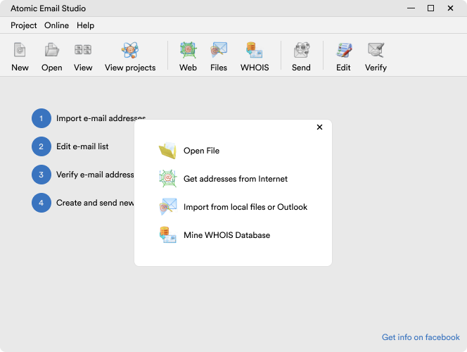
This is all about making the email message comfortable to read and act on a mobile device. Think as a recipient and don't forget to test your designs on different mobile platforms. Such software as Atomic Email Studio allows to design, test, manage and send your email campaign. Have a great campaign!


Subscribe to us and you will know about our latest updates and events as just they will be presented


