Why should emails have a unique and effective design? It's simple: if your competitors have learned how to create engaging content, you also need something special to attract the user's attention. Design is a great tool to do this and supreme your competitors.
In this article, we've gathered some of the five most inspiring email design ideas to boost your campaign. The use of these samples will help to brighten your letters and reveal more about the principles that will help raise your emails' design - both for New Year's and for any other campaigns.
In the beginning, surely you need to do some research. Before designing your series of letters, study your target audience, their behavior:
Take the time to re-formulate your strategy as you start working your email layout. It is not necessary to spend a lot of resources on this; it is enough to answer a few simple questions first:
Answering them will ensure you are in the right direction and, perhaps, even may find exciting insights for your holiday campaigns.
When it all is clear, get down to pitching the best email samples to try in your new email layout. Start working on your latest campaign with new inspiring ideas and reach the top results.
If you've decided to interest the user in a specific Christmas promotion, do not forget that the time you can keep the reader's attention is limited. You need to show the essence of the proposal asap within the chosen period, with an expiry date.
If you have sales, be quick and clear about them, use bright design colors & catchy images. But don't forget who your customer is: not every audience will appreciate flashy colors and aggressive headlines, for example.

Here’s a traditional red colored responsive email card with congratulations, and a sales offer with a due date. A must have of any Christmas campaign. However, there are lots of non-standard design ideas to try. So, feel free with more creative email design ideas.
An essential part of good typography is the hierarchy. First, we talk about the main thing, and then we explain. It is crucial: you shouldn’t display the whole text to the reader at once. The users will not read a large text in a letter because they will perceive it as a homogeneous mass. If you highlight the main thing and divide the text into several parts, it will look much easier to read.
The success of communication with the user depends on how you present the main sentence's text because it is the letters that we read and understand faster than other visual images.
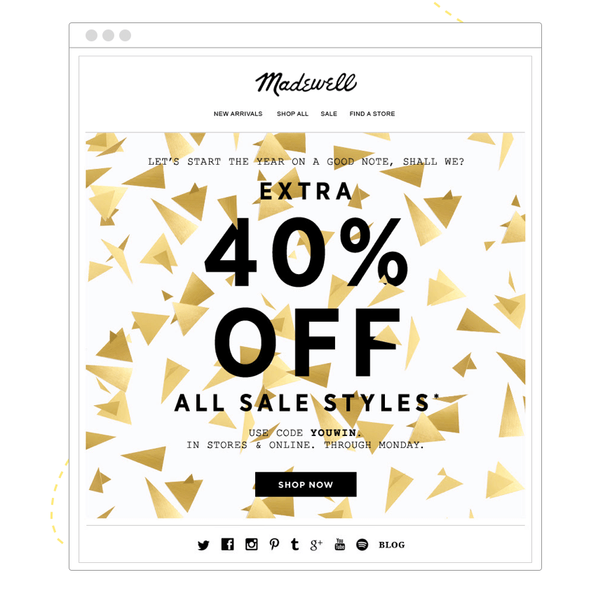
Have a look, first, we see the major words made bold and black, including the sales code text, only then - all the rest. A well underlined CTA button completes the composition. Nothing to be added. All clear and funny.
Don't be afraid to use saturated colors to emphasize a particular block or element. Or, be ready to use the standard formal color pallet. It's up to a marketing strategy and depends on many factors.
Even if your company's corporate identity is made in restrained colors and does not contain bright elements, then a few noticeable buttons will dilute the content well and add accents.
Try to use colors and shades that fit the context of the letter and evoke the right emotions. Avoid unpleasant and dull ones - unpleasant feelings are associated with them.
Here there's a lot of color shades, but the most pleasant and rich are chosen. Non- traditional color palette is used to create the email design and make it extraordinary in comparison with a more regular Christmas- associated colors like red, white, blue, green, etc.
Try to arrange the elements of the letter so that they follow each other not only in meaning but also visually. Thus, you simplify perception and guide the reader along the route you need to the CTA button. Make things simple for your readers.
It is crucial to create a sense of integrity and harmony by arranging elements and blocks within the emails. It is these messages that are the most pleasant to receive. Through composition, we control attention and create the sensations we need while reading them.

An excellent example of a good and at the same time interesting email composition is provided from the IKEA store. Each of the blocks is read smoothly and sequentially, primarily because it has a corner cut that flows into the next. + CTA buttons which made it a good UX.
An undeniable trend that is still gaining traction is simply designed to engage your reader through interactivity quickly. Animated pictures are great for setting the mood, drawing attention to a specific part of the letter, or even arranging activities.
However, do not forget that some email constructors do not support GIF format, and of course, remember that the animation should not be intrusive and interfere with the reading of the letter, etc.
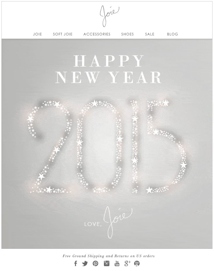
Finally, an inscription painted in silver moves almost imperceptibly, it does not interfere with easily reading any word or line, designed in similar color shades. At the same time there is a slight tension, which creates a mood of haste. Precise & laconic, though.
Apply any of the top inspiring samples to boost your email messaging campaigns. Your creative emails do not have to interfere with quickly reading any word or line, but at the same time, there may be a slight tension, which creates a mood of haste in your email design. Always remember about your reader and how he/she perceives this or that design element. Mind how justified it is and whether it is needed at all in the context of your offer.
Seek for more useful examples of great New Year emails & more from AtomPark. Enjoy it!
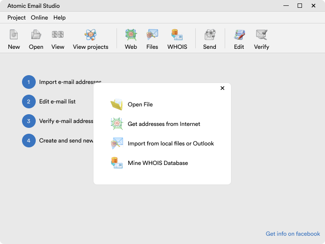
Download Atomic Mail Sender & feel free to support your improved email marketing campaigns & succeed with your New Year campaign for 2023!


Subscribe to us and you will know about our latest updates and events as just they will be presented